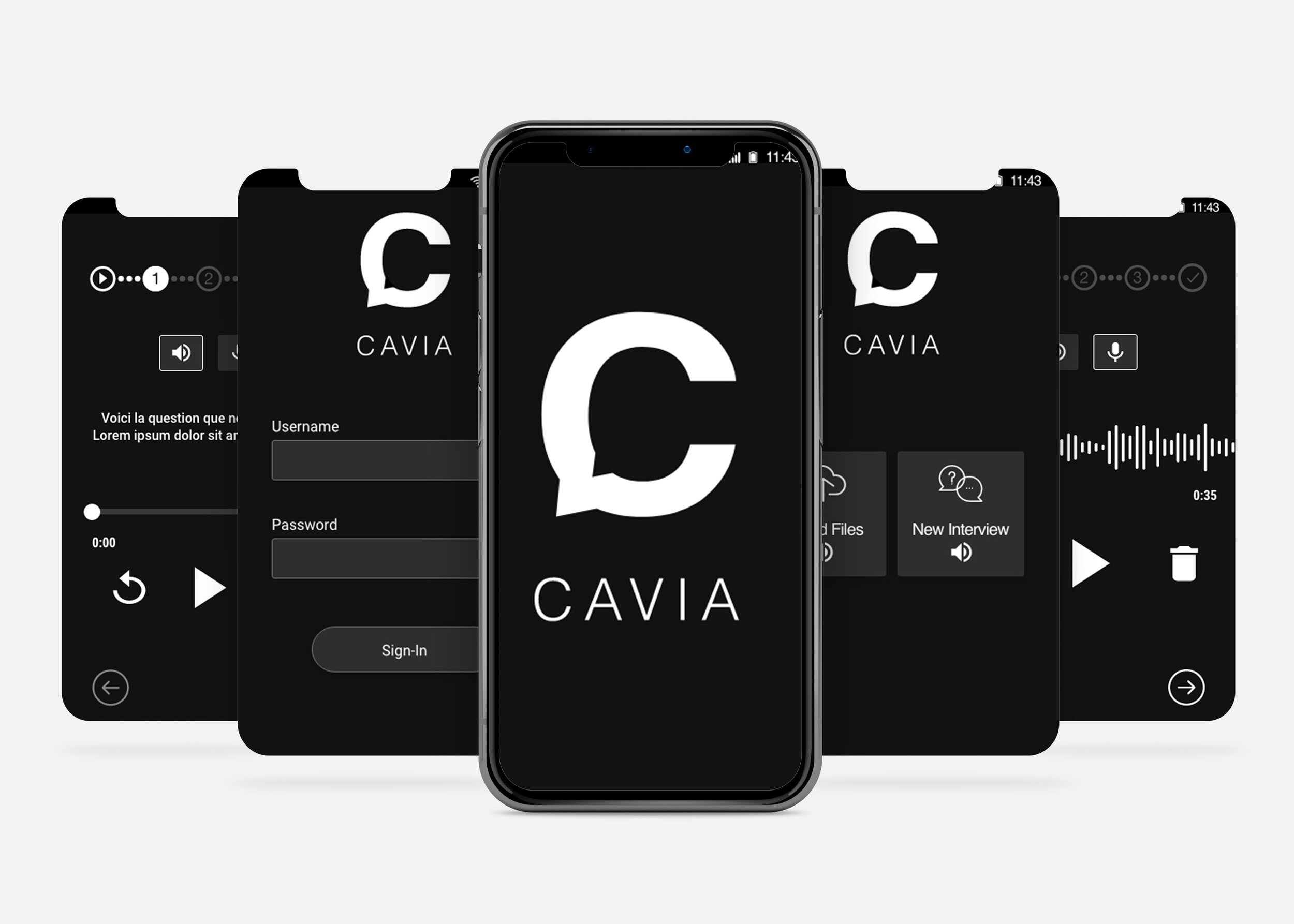
CAVIA - APP DESIGN
CAVIA will be a mobile application that will help with the Code Blue Campaign by revolutionizing how institutions engage with the communities they serve, and ensure that all voices that should be heard are part of the conversation.
The Scope: Design an app for CAVIA.
Timeline: 3 weeks (Feb-Mar 2020)
My Role: UI Designer
Tools: Adobe Illustrator, Adobe XD
Project Goals
1. Have a simple, intuitive design that is easy to explain to users who aren’t tech-savvy.
2. Audio-based design rather than text-based for users with low levels of literacy.
3. Allow users to navigate through the app at their own pace.
The Problem
To design a mobile application that enables individual audio self-recording, allowing users to orally record answers to open-ended questions.
THE PROCESS
Inception Diagram
I used an inception diagram to begin my design process. An inception diagram is a design tool to help you address the goal of your design through the mood you want it to convey as well as the design’s visual language.
For this design our goal was to create an app that allows women sexually assaulted/abused by UN Personnel/Peacekeepers to voice record their stories anonymously to later be uploaded securely.
Mood Board & Style Tile
My mood board was inspired by the personalities the client wanted CAVIA to portray — fearlessness, strength, be eye-catching, and strong.
There was no emphasis put on the style tile because the client mentioned minimal colours and text.
Design
1. A dark mode design was used to conserve battery as this app would be used in 3rd world countries.
2. Specific iconography and audio-playback will be used to enable users with low to no literacy to be able to navigate the app.
3. Micro-interactions were used to provide users with feedback while adding a level of accessibility.


